





A Japanese-inspired visual identity designed
for contemporary men’s fashion.
KOKYU is a premium menswear brand identity inspired by Japanese minimalism and contemporary fashion.
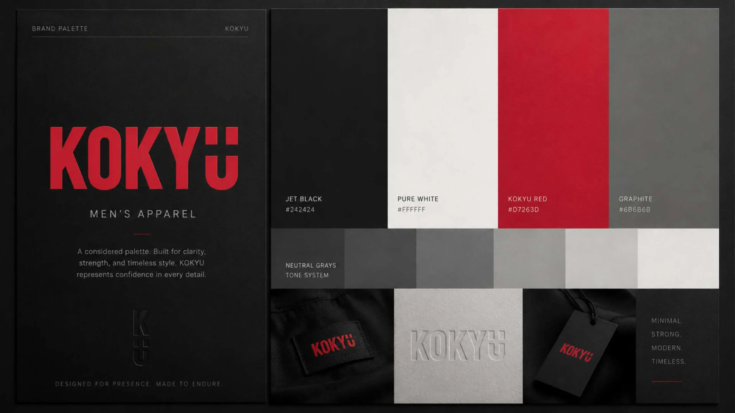
The project focused on creating a bold, sophisticated visual language that reflects confidence, craftsmanship, and modern masculine style. Strong typography, structured layouts, monochrome tones, and vivid red accents were combined to give the fashion brand a distinctive and memorable presence.
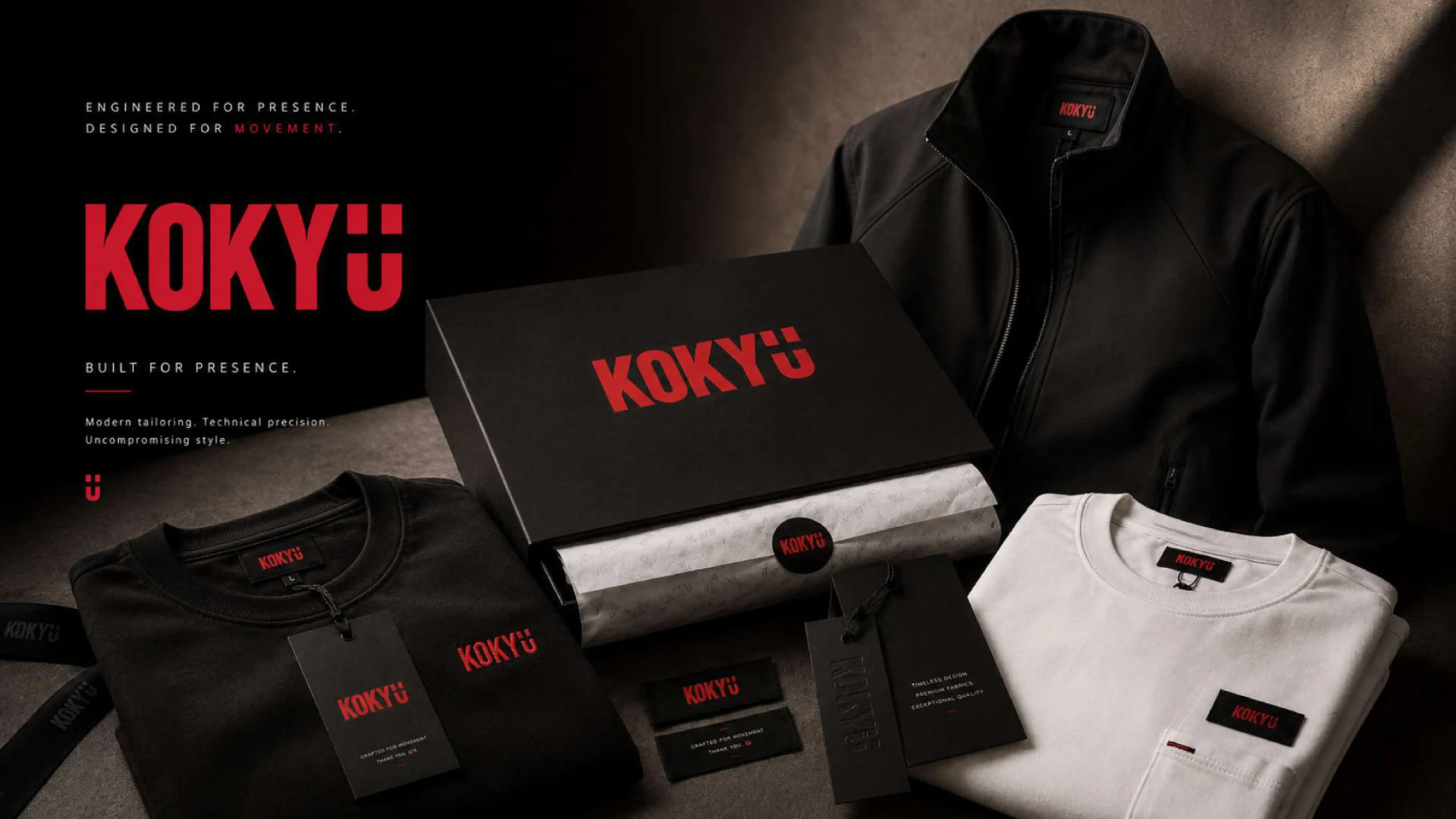
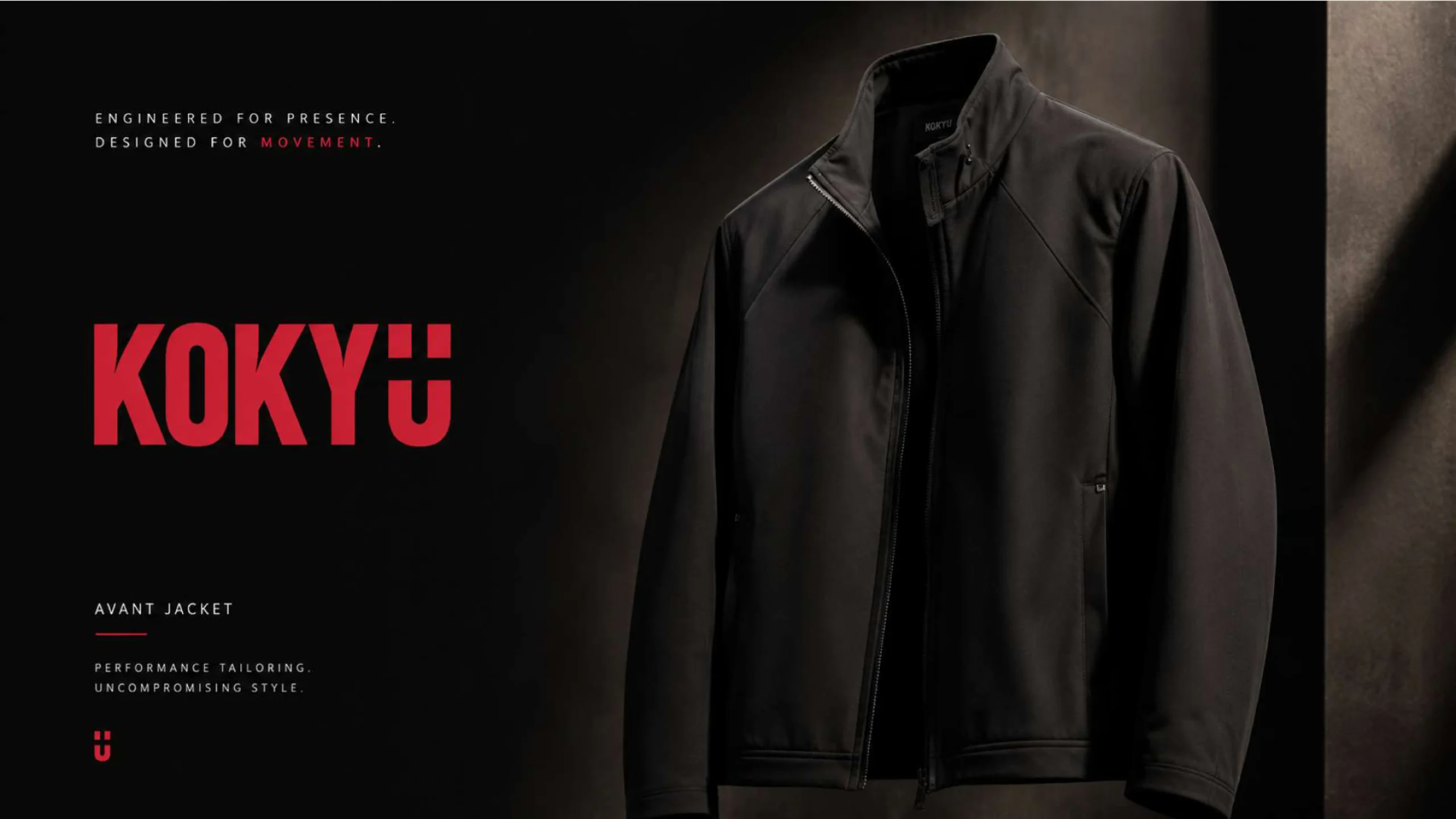
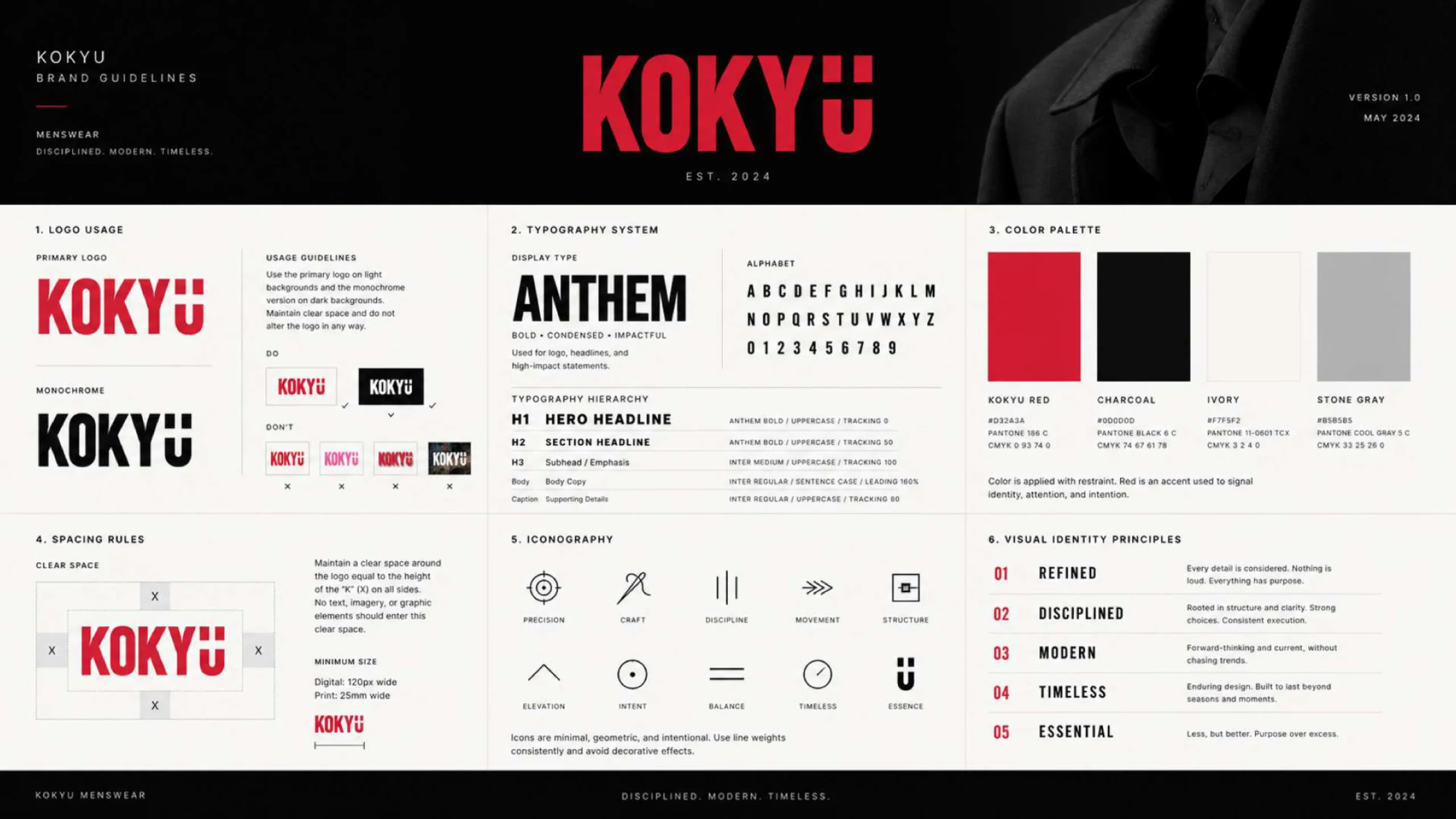
The complete branding system includes logo design, brand colors, typography, apparel labels, clothing tags, packaging, promotional materials, and digital applications. Every element was designed to maintain consistency across physical and online touchpoints while positioning KOKYU as a refined contemporary menswear brand. The result is a versatile fashion identity that balances minimal Japanese-inspired aesthetics with the energy and attitude of modern streetwear.
The research phase for KOKYU began with a deep dive into contemporary menswear, Japanese minimalist design, and the visual language shaping premium fashion brands today. We looked closely at core Japanese design values like simplicity, balance, precision, and the thoughtful use of space, and explored how these ideas could shape a modern brand identity without leaning on obvious cultural symbols or clichés.
Alongside this, competitor research across the menswear and fashion branding space gave us a clearer picture of where the gaps were. That analysis helped position KOKYU with a visual direction that feels confident, minimal, and genuinely different from what else is out there.
One of the biggest takeaways from audience research was that premium menswear consumers respond to refined typography, restrained color palettes, a sense of quality materials, and consistent brand presentation everywhere they encounter the brand. These insights became the backbone of KOKYU's visual identity, built around monochrome tones, bold red accents, structured layouts, and confident typography.
Every decision made throughout this project, from the logo to the packaging, was driven by one goal: to communicate craftsmanship, exclusivity, and a modern take on masculine style across apparel, packaging, social media, and digital platforms.
The final result is a distinctive, cohesive brand identity that positions KOKYU as a premium contemporary menswear label. The logo, color palette, typography, apparel branding, clothing labels, packaging, and digital applications all work together to create a recognizable visual presence across every customer touchpoint. By balancing Japanese-inspired minimalism with the bold energy of modern streetwear, the identity feels refined without tipping into anything overly formal. The result is a flexible branding system that stays clear and consistent across physical products, promotional materials, social media, and online platforms, giving KOKYU a strong foundation to grow from as new collections, campaigns, and brand extensions come along.